Coding N Concepts
 CSS units for font-size: px, em and rem
In this tutorial, we’ll learn different units to measure font-size in CSS i.e. px, em, and rem, their differences, and which one to use when.
Default font-size
Let’s understand the browser’s font-size first which is a key concept in difference between px, em, and rem.
Most browsers provide an ability to change the font-size from the settings. Default font-size is 16px, which user can always change according to their preference as below:
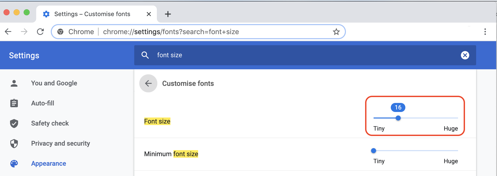
Font Size Setting in Chrome Browser
You can override the default font-size setting of the browser using CSS in this way:
html {
	font-size: 32px;
}
or
html {
  font-size: 200%;
}
Though it is not recommended to override default behavior of the browser otherwise it won’t honor user preference which is not a good idea.
PX
The pixel
pxis an absolute and fixed-size unit in CSS.
Pixels are easily translatable. For example using below CSS, font-size of p (paragraph) element will always remain 12px on all devices and screens regardless of changing the browser font-size setting, or any of its parent element’s font-size.
p { font-size: 12px; }
Although the size of a pixel isn’t always the same across devices and screens, means the actual width of the block having width: 120px on laptop is not same as on iPad.
What is the problem with px?
The problem arises, when user changes the default font-size of the browser say they want to see bigger font-size. In that case p (paragraph) element with above CSS will still be displayed as font-size: 12px since its an absolute value. User preference is not reflected which is not considered as a good user experience.
When to use px?
Pixel px is still a good choice for fixed layout measurement and fixed spacing (padding, margin, etc.) but not a good choice for flexible layouts and font-size measurement.
Alternate of px?
The em and rem are the relative (or flexible) units as oppose to px, which is an absolute (or fixed) unit. Both em and rem are translated by the browser into pixel (px) values, depending on the default font-size setting of the browser. Say, if browser’s default font-size is 16px, then
1em = 16px;
1rem = 16px;
EM
The
emunit is relative to its direct or nearest parent element.
If font-size is not defined explicitly, that element will inherit it from the parent element. The inheritance continues to take place this way amongst ancestors up until the root element. Default font-size of the root element is provided by browser.
When to use em?
1. Nested Structure
We can use the em where you want to apply font-size relative to the parent element such as menu structure.
<style>
.menu-container {
  font-size: 100px;
  border: 1px solid black;
}
.menu-item {
  font-size: 0.5em;
  padding-left: 20px;
}
.menu-item::before {
  content: '▾'
}
</style>

<div id="container" class="menu-container">
  <div id="menu" class="menu-item">
    Menu
    <div id="submenu" class="menu-item">
      Submenu
      <div id="subsubmenu" class="menu-item">
        Subsubmenu
      </div>
      <div id="another_subsubmenu">
        Another Subsubmenu
      </div>
    </div>
  </div>
</div>
We see that font-size is reducing as we go to the nested levels of menu structure even though we have applied the same CSS class .menu-item to all nested menu items. Let’s break down how browser is calculating the the pixel (px) from rem relative values.
- The
#menuitemfont-size: 0.5emis relative to the#containerso font-size in pixel would be100x0.5 = 50px - The
#submenuitemfont-size: 0.5emis relative to the#menuso font-size in pixel would be50x0.5 = 25px - The
#subsubmenuitemfont-size: 0.5emis relative to the#submenuso font-size in pixel would be25x0.5 = 12.5px - The
#another_subsubmenuitemclassandfont-sizeis not defined so font-size in pixel would be same as its parent#submenui.e.25px
2. Media Queries
The em should be used to define screen width in media queries. Here is an interesting post which explains why em should be used for media queries.
What is the problem with em?
The main problem with em is that you need to do all mathematical calculation of font-size of child elements as we did. Moreover, if you want to apply a specific font-size to child element, you cannot do that using em.
Alternate of em?
The rem is the solution of our problem. It is a relative unit and not dependent on parent elements. Let’s look at it.
REM
The
remunit is relative to the html (root) element.
If the font-size of root html element is 16px i.e.
:root {
   font-size: 16px;
}
then
1rem = 16px
for all the elements.
If font-size is not explicitly defined in root element then 1rem will be equal to the default font-size provided by the browser (usually 16px).
When to use rem?
It is recommended to use rem for spacing (margin, padding, etc.) and font size in CSS as it honors user’s preferences and provide better user experience.
px to rem when root is 16px
you can use the following table to convert from px to rem when root font-size is 16px:
| px | rem |
|---|---|
| 10px | 0.625rem |
| 11px | 0.6875rem |
| 12px | 0.75rem |
| 13px | 0.8125rem |
| 14px | 0.875rem |
| 15px | 0.9375rem |
| 16px | 1rem |
| 17px | 1.0625rem |
| 18px | 1.125rem |
| 19px | 1.1875rem |
| 20px | 1.25rem |
| 21px | 1.3125rem |
| 22px | 1.375rem |
| 23px | 1.4375rem |
| 24px | 1.5rem |
| 25px | 1.5625rem |
| 26px | 1.625rem |
| 27px | 1.6875rem |
| 28px | 1.75rem |
| 29px | 1.8125rem |
| 30px | 1.875rem |
| 31px | 1.9375rem |
| 32px | 2rem |
| 33px | 2.0625rem |
| 34px | 2.125rem |
| 35px | 2.1875rem |
| 36px | 2.25rem |
| 37px | 2.3125rem |
| 38px | 2.375rem |
| 39px | 2.4375rem |
| 40px | 2.5rem |
| 41px | 2.5625rem |
| 42px | 2.625rem |
| 43px | 2.6875rem |
| 44px | 2.75rem |
| 45px | 2.8125rem |
| 46px | 2.875rem |
| 47px | 2.9375rem |
| 48px | 3rem |
| 49px | 3.0625rem |
| 50px | 3.125rem |
| 51px | 3.1875rem |
| 52px | 3.25rem |
| 53px | 3.3125rem |
| 54px | 3.375rem |
| 55px | 3.4375rem |
| 56px | 3.5rem |
| 57px | 3.5625rem |
| 58px | 3.625rem |
| 59px | 3.6875rem |
| 60px | 3.75rem |
| 61px | 3.8125rem |
| 62px | 3.875rem |
| 63px | 3.9375rem |
| 64px | 4rem |
You can also calculate rem using Pixel to Rem Converter
Final Thoughts
The best practice for the web developers is to:
- Use
pxfor fixed size layout (width, height, etc.) or fixed spacing (margin, padding, etc.) - Use
emfor nested elements (tree, menu, etc.) and media queries - Use
remfor flexible layout, spacing, and font-size